

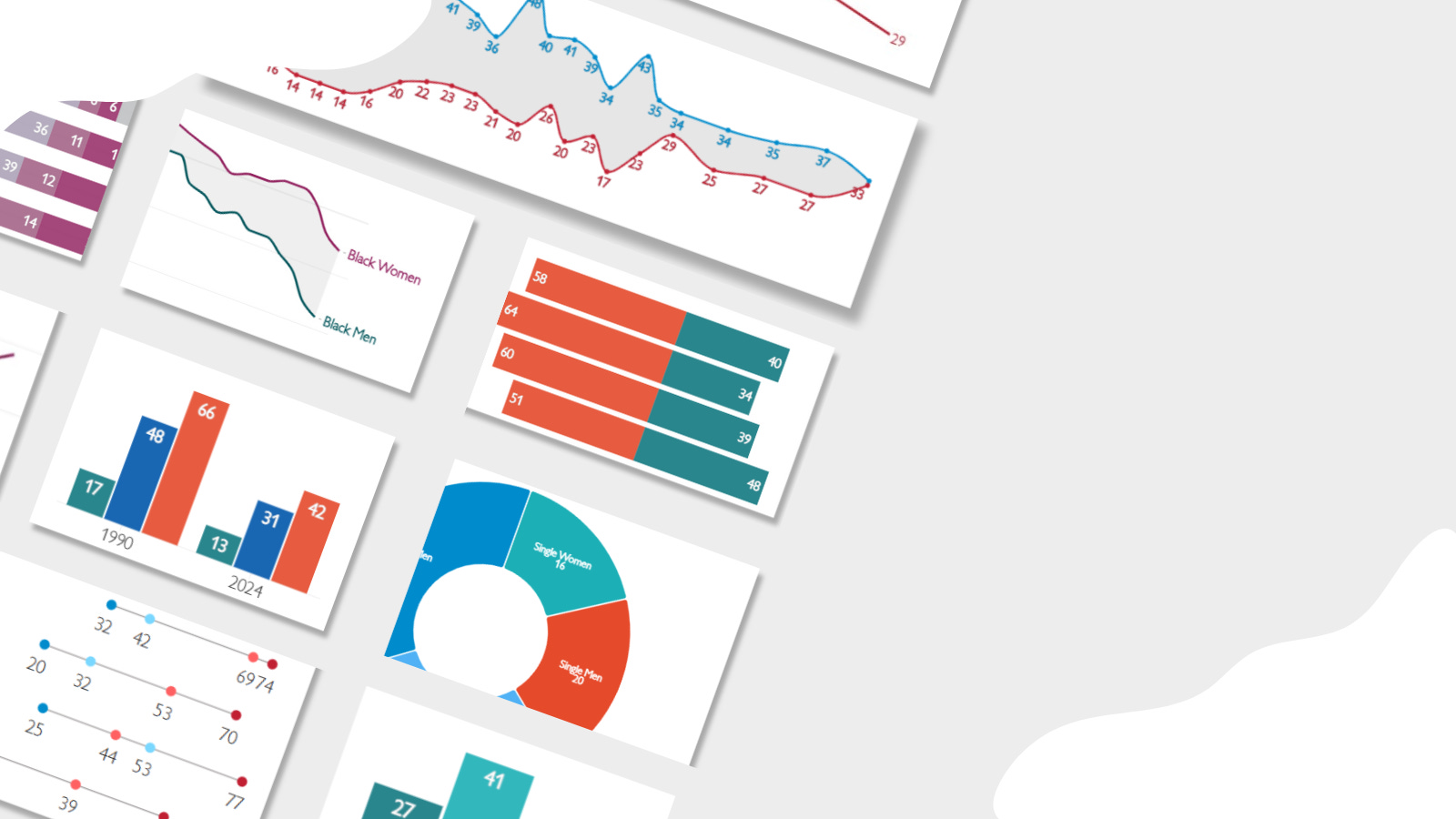
Every year, I dedicate the last newsletter to showcasing some of the most intriguing charts and figures from our surveys. It’s a great opportunity to review all the work that was done over the past 12 months, and in some cases, revisit research that I’ve completely forgotten about. A year is a long time!
The selection of these charts and figures is, of course, subjective, but this year my decisions were based, in large part, on what resonated among people who read and write about our research.
1. The Diverging Political Paths of Young Men and Women
